7 Ways To Increase Online Store Conversion Through UX Design
By Anthony Indraus May 22, 2019
Your online store has now been online for quite some time, sales are coming through, but you still feel it could be doing a lot better. You run some Facebook Ads, more traffic comes through, sales go up a little bit, and you start crunching numbers and you that your conversion is not great, now you need to increase your online store conversion.
There is an abundance of ways that help you increase your sales conversion, but the most important one is usually overlooked by store owners. User Experience design! Yes, you might have a beautifully designed store, with the best images on the market, but if your UX (User Experience) is not optimised, you could be missing out on a lot more money that you could be making.
This post is by no means a complete solution to your user experience woes, but it will give you a good understanding and a great starting point, to help your online store convert more by making and implementing a few changes.
Make sure information is available and uncluttered
How many times have you browsed an online store, tried to look up more information only to be disappointed with a one-liner? Whatever product you are selling, you need to make sure information is available describing what the product is, and how it will make your customer’s life different if they decide to purchase it.
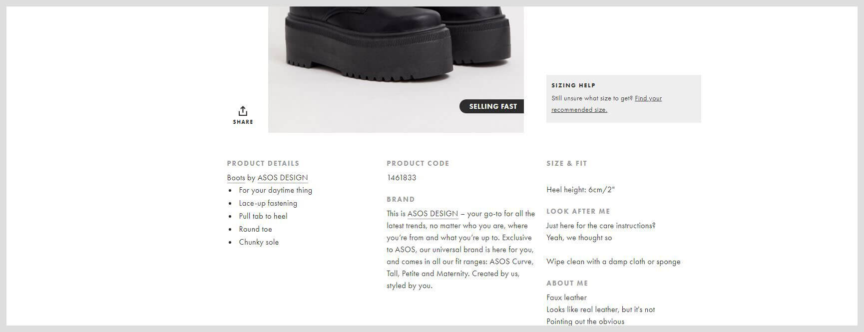
Don’t shy away from creating product videos, they are the sole champion of sales with no contenders! Video communicates your message better, so including one in your product description will help push your customers a little bit closer to the checkout button.
In saying that, don’t just stuff your page with useless information, and don’t make it an 800-word long paragraph! Make sure the description and video are displayed in an uncluttered layout, easy for the viewer’s eyes to scan and get the information they are after.
Unmissable Add to Cart Buttons
Ok, this one definitely sounds very obvious, but sometime you might get distracted by making things very pretty and just create an add to cart button that is so good it just gets lost within the full layout of the page.
By unmissable add to cart buttons, we mean a button that is in a prominent position on the page and invites the user to click it, also try to implement a sticky Add To Cart Button, Sticky Add To Cart Buttons tend to get 8% more conversion.
You will also want to use colors that attract the user attention, but without distracting the user from reading the important information displayed on the page.
Simplified Checkout Process
The checkout page is the land of abandoned shopping carts, take a look at the chart below to see what are the main reasons users abandon their carts:
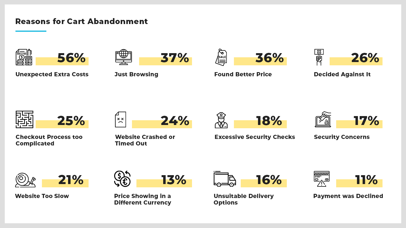
As per the chart above, there are a few things you can implement in your checkout page to ensure you decrease the number of cart abandonment on your website, mainly focusing on transparency showing the total due amount from the first page, instead of adding shipping & tax later on.
The other would be simplifying the checkout form, try to remove any unnecessary form fields, instead of having different billing and shipping addresses, display a checkout box asking if the delivery address or shipping address is different.
It is also important to offer guest checkout, do NOT force your customers to sign up in order to purchase, you need to entice them to sign up, offer them a discount or track their order through signup.
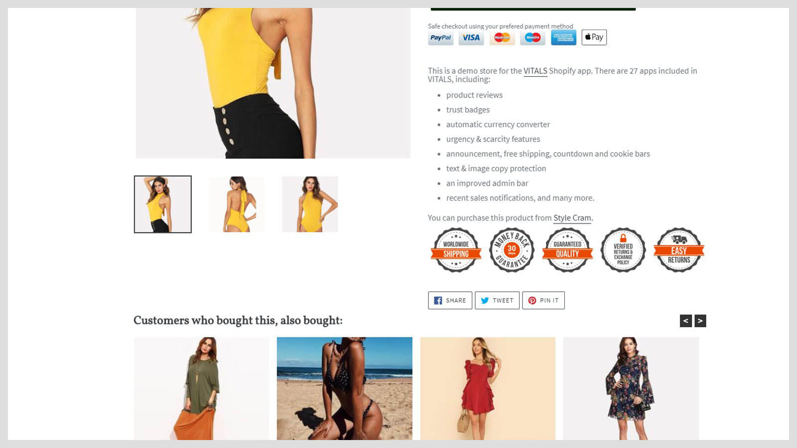
Reduce your customer’s risk with Trust Seals
While offering guarantees, refunds and free returns are great ways of building the trust bridge with your potential customer, it is also important to keep reminding them of why they should trust you even more.
It is important to display security seals as pictured in the image below, but you can also take it a step further and turn your offerings into badges and seals (i.e. 30 Day money back guarantee badge) these will encourage your users to click that sweet Add to Cart Button.
Persistent Shopping Carts
While the majority of eCommerce platforms come with this feature built in nowadays, it is still important to mention and make sure your website does support it.
How many times have you added something to cart online, only to be distracted by a phone call, a message or completely forgetting about it? probably a lot, a persistent shopping cart installs a cookie on your users’ computer, so the next time they visit your website, their cart updates with the items they have added the last time they visited your online store.
Having a persistent shopping cart, along with retargeting ads and abandoned cart emails, you will be sure to convert some of those forgotten items left in carts all over the internet.
Infinite Scrolling instead of normal pagination
Infinite Scrolling is like going down a rabbit hole if you are wondering what examples can we provide, Open up your phone and go to Facebook or Instagram, once you reach the end of the news feed the app will load more entries.
With browsing there are two schools of design, you can choose pagination, which is a list of numbers at the end of page displaying a set of entries, or infinite scrolling which is kind of similar displaying a set number of entries but when you reach the end of the page, it will automatically load the next set of entries.
The trick comes with desktop and mobile design, on a desktop it is usually recommended to use pagination as it allows users more flexibility with navigation, skipping pages if they choose to, while on mobile opting for infinite scroll will give your visitors a native mobile experience.
Mobile Specific Experience
With eCommerce it is no longer just acceptable to make your product page view collapse for mobile, with mobile shopping growing every single day, it is important to design a mobile-specific experience for your website to encourage users to purchase your products.
Leverage the power of gestures on mobile screens by allowing users to navigate the product page and explore your products through swipes. Whether it is allowing them to zoom on products through “pinching” or sliding product horizontally, through heat mapping you can figure out new ways of optimizing your user’s mobile experience.
Conclusion
While this list doesn’t offer specific changes or implementation, it is supposed to serve as giving you a base idea of what is possible and what sort of implementation to help you increase online store conversion with better user experience.
I would highly recommend diving deep and research all the points mentioned and evaluating which would help your business and which won’t. If you would like us to explore your online store potential with you, we are currently offering a Free web audit and strategy call.

Be In The Know
Sign up to our newsletter to receive the latest updates and tips from our blog. Don't worry we hate spam so we would never spam you.